Shawn Level 2

Thursday, 2 February 2017

Unit 16 My final logo Breif step by step and why did I make it.

For my final assignment for my brief I was assigned to gather around all of the logos that I drawn and chose the one that I will be doing for my final logo of this brief.
The logo brand am going to make is Istudio.


Step 1 open above illustaor and open up a new file.


Step 2 Make a new layer and get the circle by using the eclipse tool,  drag it around and then change the colour to black for the fill. Also add the stroke on the white and the size for stroke should be 2mm.


Step 3 Now make two rectangle shapes. Add a stroke on both of these and the size for stroke should be 1mm. Don't fill in the rectangle shapes!!!!

Step 4 Now get the line segment tool and start making a bunch of diangoe shapes on the two long rectangles while the middle rectangle make a straight line.

Step 5 Now get the text tool and type STUDIO in capital letters.


Then change the text size to 37 and also change the character to Apple Chancery.
Also change the size of the O to 64pt

Step 6 Now make a circle by using the eclipse tool.
Click on shape, click on the pie start angle and change in to 180%.
Copy and paste the same circle and do the same thing but in reverse.

Now change the first half circle to while and leave the second one white.


Step 7. Open a new layer and get a rectangle tool. Make sure the rectangle cover the whole page while doing it. Then fill the rectangle red. Then drag the layer that used to make that red rectangle to the bottom so you can see all of your other layers.

Step 8 Click on the window, go to symbol, click on vector grime, then click on symbol sprayer tool and spray the 4 corners of the background.

Final step hold click on the symbol sprayer tool so you can access the symbol sprayer size tool.
Now click on the direct selection tool. Lock all other layer apart from one you just sprayed. Now drag the selection tool all around the logo. Then go back to the symbol sprayer size tool. Make the Vector Grime smaller by clicking on it as well as holding alt.

Do this for all four sides.


Now you finished the logo.


This is the final design
There are the amount of layers that I used

How did I get ideas for this logo?


Well for starters I decided to take two of the logos that I researched on the Internet and one of my original designed logo and ultimately I decided to draw my final logo from scratch using those logo ideas. Also my design of the logo was based from a company called BBFC which they use circle logos on they dvds and I repeat they style so people who view designs from IStudio will get better recognisable from the media industry.

Some research ideas from the net.


Why did I decide to make this logo.
I honestly wanted to make a logo that can appeal to the media industry because I feel that logo has great design that is appealing to the audience.

How would this logo benefit for other media sectors?
This logo can be be suitable of other media sectors such as movie image for independent filming and gaming.


This are some the panel and tools used to create my logo. 

Type size

Angle

Stroke width
Tools 


Layers used


New layer tool


Tuesday, 31 January 2017

Unit 16Logo Ideas Part 2 my own drawing and research

For my next part of my brief I was asked to draw a series of logos for my Istudio project.
There are some of my ideas.


I also needed to get pre done re-search idea from books so I can all of my ideas around.
The book that I choice is scher and the logo layout style that I picked is Rosmarine Tissi.
Why did I chose this logo style for starters I want my logo to be nice and recognizable for that target audience.

I also watched a youtube video where a man explains the information of logo design as well as giving tips and hints of how to make your logo a success.


4 Things I Wish I Knew When I Started Logo Design  Published on 2 Jul 2015 https://youtu.be/kZ7phYnPxk4


Wednesday, 25 January 2017

More logo research for the breif internet research


For my next part of the brief I was assigned to create my logo by using a design that is apporive for my design.
There are some of my ideas of my logo so far that I gathered from the internet  I keep the same design but I will change a few of things such colour, font, texture lighting etc.


Thursday, 19 January 2017

Logo research for the Brief.


Intro.
For my first task I was assigned to do to research and anazlye the details of each logo and what that logo can so 
What is a logo. 
A logo is a symbol, name or trademark of a company. Logos are used by companies because they represent a concise image of the company. A picture, as they say, can tell a thousand words. People generally find it easier to remember a simple image over words alone. Our eyes are drawn to visual objects and well designed logos add visual appeal to printed documents and web pages.

Types of Logos.
There are some of the example of each types of logo.


The kelmoscott has the more french look to it because of the square layout and the title fonts.
Also it has the flower pattern and if you take a future look at it. It has symbolism because the way that the flowers are positioned and designed represents the french revelation.
The title font is bold and has the more french design to it. It has a scroll design to it.
Also the only colour that is used in this logo is black and white to give the older feel to it.
This logo beings to the genre of classic because it has the 1880s feel to it when the person is looking at it and can appeal to the people of the old.


  NOPICNIC is a mainly a square logo designed with retro letting on the middle. It has a smooth texture on the text on the middle that allows the reader to see it clearly. On top of that the background is a nice flat red design. This logo looks like it belongs into a gaming genre because of the retro style fonts and the contrast of the logo being high.  Outside the flat red background there is a small but a visible grey square and it tells the audience that this logo is a company of gaming company.
Okay its NOPICNIC not a gaming company but its look like it can fit into a gaming company.
If I was able to make something similar to this logo my background  will be light purple and the fonts will have the same retro style but lettering will be different.
Rockstar Games
Media Sector Gaming

This logo can be very comparable with the rockstar games logo because because both of these logos have flat smooth colour.
The difference between each logo is the rockstar games has no edges whatsoever while NOPICNIC has edges.
Secondly unlike NOPICNIC Rockstar games only use one letter because they want to make it iconic as possible.
Lastly both logos have very different styles that matches the theme of that certain target audience for example the rockstar games logo is targeting to a more modern audience while NOPICNIC looks like its focusing on the retro gaming audience.


BRASS logo is mostly simple because the background of it is grey and at the middle of the text its light grey/white. The letters of this text were played around with because there were all made by using various tools such as the rectangle, eclipse and knife tools as well as the warp and width tool.  This logo looks like it belong in a shoe brand because of the way it was designed and most shoe brands like nick and addis use the same techniques on they designs.
If I wanted to make this logo I will be using the following tools.
Knife Tool
Text Tool
Ellipse Tool
Width Tool.
You may notice that on top of the logo all of the colours of the pallet are used and all of the colours were turned using the twirl tool.

Now unlike any other logo in this post this one has a twist because after the second half of the text is flipped upside down.
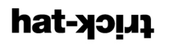
Other than that this logo is very simple with a generic black bond on the text. There is no background whatsoever and all the letters are all under cased. It's a sans serif font because there is no extra bits on the letters. 


Step by step guide for this logo.
1. Open up illustrator
2. Click on file and new.
3. Set the size 576W/711H
4. Now click on the type tool
5 Type in hat- (lower case letters) as well as bold text
6 Than make a new layer and click on the type tool again and type in trick (lower case letters) as well as bold text.
7 Now click on object and click on expand on the text. 
8 Now drag both text to the point.
9 Now select the layers and merge them. 
10 Highlight both text and make them bigger
Now your are done making the logo
Just a short example but it may not be accurate to the actually logo

Like with the Hat-Trick logo this start logo is mostly simple but instead of second half of the word being upside down this one is more unique. for starters the s and the t is connected to each other because they have been starched out. 
Also the font that is used in this logo is comic sans bold.
One more thing about this logo its it a rubber style to it because threes is no straight line 
Other than that its pretty much the same to the previous logo that I covered designed wise.

1. Open up illustrator
2. Click on file and new.
3. Set the size 576W/711H
4. Now type in .start in bold test(lower case)
5 Now get the warp tool and click on the s and t as well on a and a bit of on the air and make it more cartoonish 
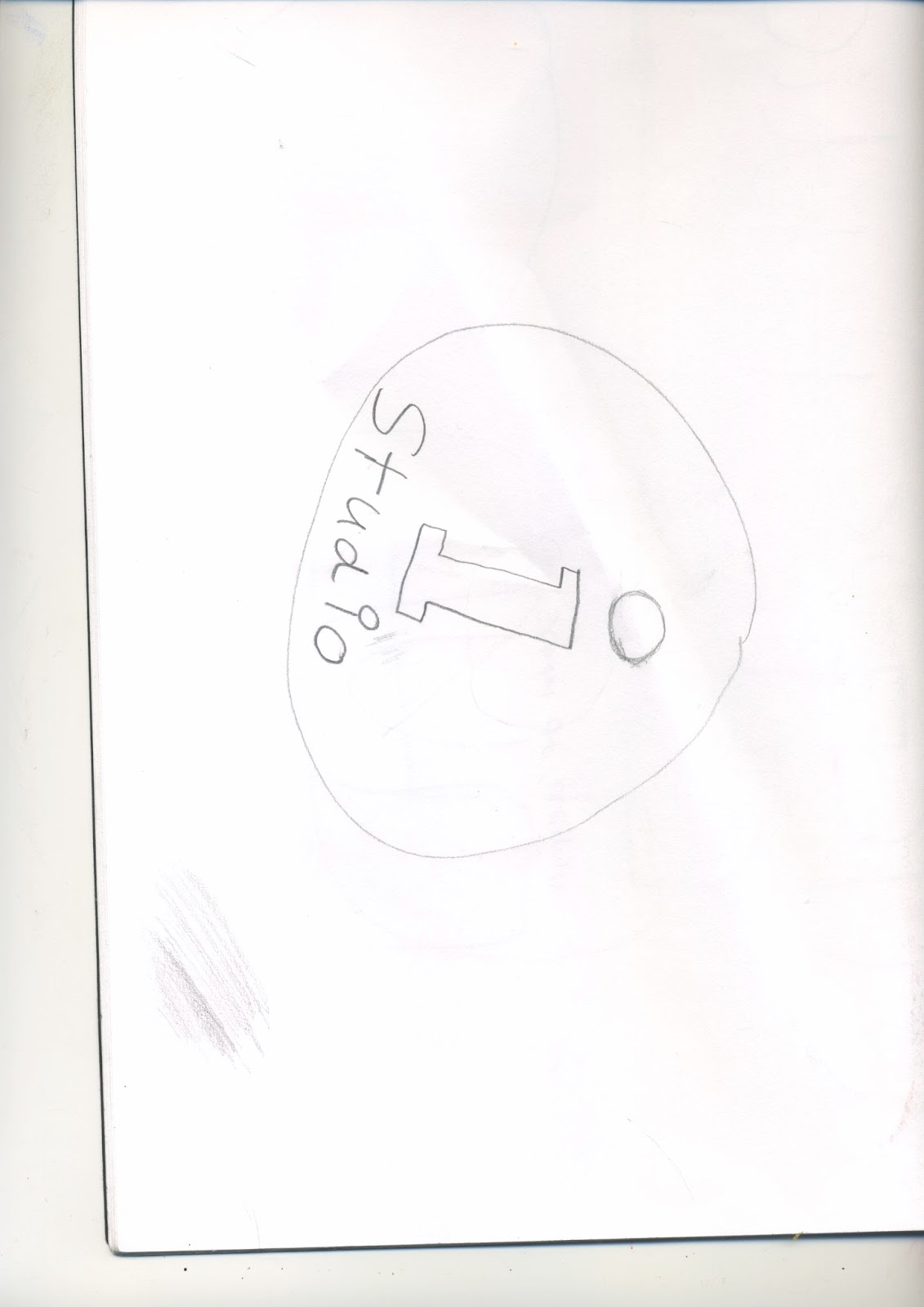
 6 Make a new layer, get a circle by using the ellipse tool, create the circle and make it big
Now make an another new layer and using the text tool type in R in a capital letter.
Now drag the R towards the circle. 
Now merge the layers of the circle and R.
Lastly resize both the circle and R to make the small as possible as well as dragging them towards the t.
You have finished your logo  

The last logo for this post veryday is once again has a very simple design text wise. The text size is 18pt and unlike the last two logo that I covered this one actually colour on the text and the colour that is used for this text is light brown. Also on the left side of the logo there's a logo that is designed like the heart. There is low key lighting on this logo.
Also the logo on the left features 3 colour that are light colour for each type of colour. 
The designed of the heart is very unique because while the first half is coloured in browned the second half of heart has two colour of purple and pink. 
This logo looks like a logo that can be used for an animation software.


Thursday, 8 December 2016

Typographic Hierarchy

Today I was assgined to change my text by applying  Typographic Hierarchy into my text
There are some blank examples that I found and I was asked to changed them. 


For my first one I decided to change the font style to Marker Felt for the title while the small text I decided to change it to a Marion font. You may  notice that I kept the same colour for the first one because I wanted to keep the style more modernize and appealing. Also I decided to change the size for both of these. For the Marker Felt font I changed it to 16pt while the Marion Font one I change it to 13pt.  Also for my Marker Felt one I decided to give it a wide appearance instead of a thin appearance.


For my second one I decided to change the colour for my text because while my first one was a more modernize font style while this I chose the colours Dim yellow and Light Blue to give it a more summer theme to it. The font that I chosen for this is Bangla MN for the top while I use Minion Pro for the bottom. For the Bangla MN font I changed the size to 16pt while the Minion Pro I changed it to 15pt. I also increased the weight to 95mm for both of theses.

For my third one I decided to use Arial Black Bold for my title while the regular text I used Lithos Pro.  Like with my first one that I did I used the same colour format. I.

Finally my last one I used the light pink Arial Narrow font to it while I used the same black font color for the bottom but I changed the font style to Kannda Sangam MN. The last has the same size font of both of them. 

Monday, 5 December 2016

Christmas Card

Today I was assigned to make a christmas card for my mini berif project.
This is how I made it.


In order to make a card you will need to create a new file by this method.

Then I started to create various shapes and deigns in relates to the theme of Christmas such as a snowball, Christmas tree, Christmas ball and so on.
Also I named the Christmas card Secret Santa and I designed it with a Christmas feel to it meaning I used the rubber tool to create small holes in certain places.


I used the these following tools to create my Christmas card.
Stroke Tool.
Pen tool
Rubber Tool
Text Tool
Line Tool
Then I


Thursday, 1 December 2016

Style of art CD Example.

The background has the nice sample black style to it and it really fits the style of the album.
The type font on the top has the more classic feel to it with the nice white thick font on top of that.
The bottom text font contains a classic bubble writing that also its with the theme of the cover.

Lastly the straight lines and the mountains are hand drawn. You may also notice that the the right straight lines are fading out because the white charcoal was running out and it fits the style of the cover.


If I compare the style of Joy Division Unknown  pleasures album to the more modern Seki Shay stories that touch album you will see the massive difference in the terms of age and style usage.
For starters the while charcoal doesn't fade out at all compare to the unknown pleasures album.
Also the unknown pleasure album only feature mountains while the Stories that touch album features a face because there was a bigger gab of technology where most albums covers in the 70s will only use artistic drawing.